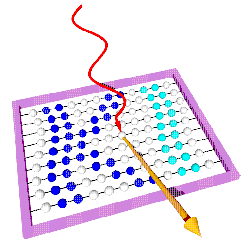
Our logo is to symbolize the process of an photo electron's emission from a
solid. Electromagnetic radiation incident on the surface of a solid excites
an electron to emission.
The spheres represent several concepts:
- As atoms and centers of scattering in a big and non-ideal surface cell
they point to the physics at hand.
- With their varying positions they can be viewed as bands with
different dispersions and are reminiscent of the basic theoretical
concept of the electronic band structure.
- They are the spheres of an abacus and represent the
numerical aspects of our work.
- The colored bands form the letters KI, the abbrevation for Kiel.
The frame is coloured purple, which is our alma mater's official colour.
The logo was created by Frank Starrost.
|


![]()

![]()